 I’m very happy to announce the release of Sixis for iPad. This is an adaptation of the dice game of the same name published by fellow Bostonian Chris Cieslik of Asmadi Games. I became convinced to take it up as a project after overhearing more than one smart friend independently describe the original game as “Yahtzee, except good.” That’s as good an elevator pitch as any, so I’ll just pair that with a note that Sixis works on any iPad running iOS 6, and costs US$1.99 (or your local equivalent).
I still need to cut together a trailer video; a swell of day-job client work carried the chance to do that out of my hands this past week, but I can offer a sort of artist’s statement, which constitutes the remainder of this post. While the core game design is not mine, I did find myself faced with many interesting decisions while crafting this digital adaptation, and I’d like to write a bit about why I chose the paths I took.
I approached this project as a chance to explore my own obsessions about tablet-based tabletop games, and experiment with the form by mixing in both lessons and counterexamples that I’ve seen in the many iPad games I’ve played over the last couple of years.
My choice to limit the form factor to tablets, rather than phones, stems from my specific desire to create something that would lay flat among the players, who would gather around the device, facing one another. In my experience, a pocket-sized screen just doesn’t work for that style of play. More generally, I do not care for “pass and play” board-game digitizations on any screen size. to give only one player at a time complete sensory access to the game strikes me as anathema to tabletop games, which need some common, always-available element (e.g. a game board) to keep players feeling anchored.
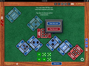
Furthermore, I wanted to avoid the need for any sort of card-zoom feature — that is, a button or gesture that would blow up an individual card so that you could read its text more clearly. The original Sixis printed design, to its credit, centers around bold and meaningful die-silhouette graphics that look nice even scaled down, which helped my cause. But players still need to read the little bit of label-text on each card, and limiting my canvas to only larger screens that would keep those labels always legible simplified things significantly.
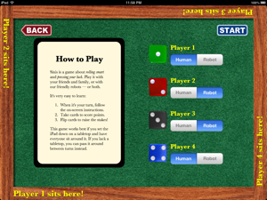
 I knew going in that a core goal was absolute simplicity of user experience. I got bolder about this as the project continued, with my deciding to abolish any notion of a tutorial play mode, or even a simple illustrated-text instruction screen. Instead, when you tap PLAY! (the only interactive element on the main “menu”, aside from the show-credits button) the screen displays two things: a simple, one-question-at-a-time game-setup wizard, and three short paragraphs assuring the player that they’ll learn the game by just diving in and following along. The former is my reaction to great iPad tabletop games with nerdy and confusing setup screens, and the latter comes from my increasing lack of patience with well-intentioned game tutorials that feel like they’re forcing you to trudge through through a dull, scripted, and overly chatty pantomime of the game you wish to play before you can actually start having the fun you signed up for.
Therefore, one somewhat risky experiment Sixis runs involves its reliance on embedded help-cues. On each player’s turn, the game dedicates a small bit of the screen to telling them what they can do right now, with that text changing as their turn develops. The idea is that players should never feel confused as to their options at any given moment, but the game still leaves it up to them to piece together how these discrete actions work together into a path towards a goal. The lead-in text briefly defines this goal, telling players that they should collect cards to amass points and flip cards to “raise the stakes”, without getting any more specific. My hope is that, after a couple of go-rounds, players will catch on and see for themselves how the game’s rules mesh, and move on from there to developing strategy. But in the short term, preventing the player from feeling adrift seemed like the very first thing to get right.
This cue-text is not hideable. I tried to design it to fill a role akin to quick-reference text one sometimes find printed in the corners of physical game boards: visible enough to be obvious and helpful to newcomers, but unobtrusive enough to fade beneath notice once one is more experienced. I could have added a user preference to hide this text, but that would have meant adding a user-preference screen at all, the avoidance of which was another of my design goals. iPad Sixis offers you only the game: the less meta-stuff there is to get entangled within, the better.
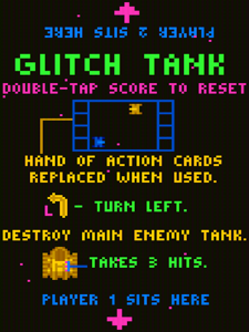
 I didn’t realize it until the project was well underway, but I took a lot of inspiration from Michael Brough’s Glitch Tank, a real-time two-player game for nearly all iOS devices, but which works best on an iPad placed flat between two players. During game setup, one edge of the screen is labeled PLAYER 1 SITS HERE and the other — in text relatively upside-down from the first — PLAYER 2 SITS HERE. I adapted this text, orientation, and placement directly into Sixis; it appears after telling the game how many people are playing, with (if present) Players 3 and 4 instructed to sit along the remaining two edges. From that point on, each player’s perspective into the game board remains fixed.
As in both Glitch Tank or an analog board game, the view does not spin itself around to face each player in turn, nor does it expect you to spin the iPad itself around. Taking a cue from both Glitch Tank as well as “cocktail” form-factor coin-operated games of yore, every player receives their very own set of controls, affixed to their own side of the board and rotated appropriately. During their turn, the cue-text hustles itself to an area of the screen out of the current players’ way, and rotates itself so that it’s rightside-up only for them. While all that’s going on, the inactive players can continue to survey the board, take stock of their own situation, and plan ahead, all without having to deal with any dizzying between-turn changes in screen orientation.
Like Glitch Tank, cocktail games, or real board games — but rather unlike the majority of iPad board game adaptations — you cannot set players’ on-screen names at all. In early builds I took the more typical route of offering customizable names, but then I observed that after a few plays testers would just accept the default “Player N” handles in order to start playing faster. Despite its ubiquity, I concluded that this activity represents a completely unnecessary obstacle. If there’s no need to prepare name-placards for every player when playing with real dice, why introduce it digitally? So, out it went. I replaced it with a fun, discoverable (I hope!) die-color-chooser, featuring all six die-colors that ship with Asmadi’s Sixis edition. As testers pointed out to me, piece-color is a much stronger source of identity when playing tabletop games than name-labels.
As to why the game requires iOS 6 (thus excluding itself from first-generation iPads), doesn’t offer network play, or runs only on Apple-branded hardware: All these are choices I made to favor getting a nights-and-weekends project released relatively quickly and with a fair bit of testing and polish. All these suggest improvements that I could introduce in future updates, in the order listed at the start of this paragraph, as that’s also an order of increasing difficulty and time commitment. It will depend entirely on the success of the current version, and any other sources of motivation I might receive. But for now, I am very pleased with what I have accomplished, and I would very much welcome your own thoughts on it.


I've only played Sixis once (the physical version), and I recall my enjoyment of the experience being marred by an inadequate up-front rules explanation. So your learn-as-you go approach makes me a bit nervous that an adequate understanding of game-flow for useful for strategic decision making might not be achieved until a few turns have been played. Also, while a full-text rules document is not necessarily the best way to learn a digital game up front, it is often useful to have one available as a reference for resolving ambiguities and other rules questions later.
Of course, I don't have an iPad, and am thus not a potential customer for this app, so my opinions mean absolutely bupkis. :-)