
I was bored Saturday night (yes, I'm allowed to be bored) and asked around for game suggestions. Someone mentioned that Desktop Dungeons was out for Mac. I had only the vaguest memory of having heard of Desktop Dungeons, but I gave it a shot.
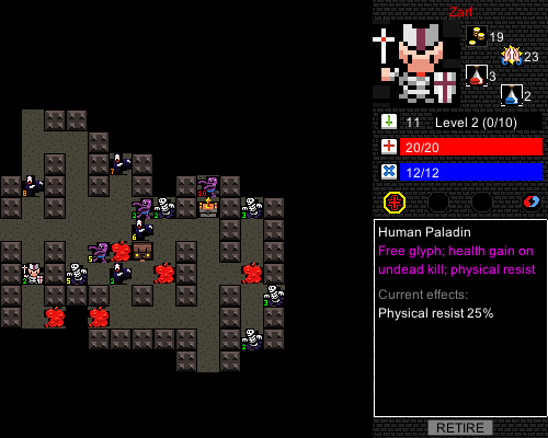
The dungeon is a little larger in real life, but I've clipped the shot rather than shrinking it.
Turns out it's a microroguelike. Meaning, it's Nethack, only short. That's nifty. The designers say it's aimed at ten-minute game sessions. It takes me twenty or thirty, because of their other nifty idea: the combat is (almost) completely deterministic. You strike for a fixed amount of damage, the enemy strikes for a fixed amount of damage. You can see all the stats in advance, so you know whether you're going to win. Also, the monsters are static -- they sit still and wait for you to pick fights.
This turns the usual odds arbitrage of roguelikes ("do I want a 5% better chance to hit or a 6% better chance to dodge?") into a series of specific puzzles. (Which I then way overthink, which is why my games run a little long.) Of the N monsters I've run into, which ones can I kill? Will they provide enough XP for me to level? If not, should I explore further? The game's goal is always a specific level-10 monster, so you aim for that.
There's a nice handful of other game mechanics which I won't describe. It winds up as exactly as much roguelike as I want to play, so I've blasted through a bunch of games since the weekend. (One of the game mechanics I won't describe is unlocking new classes and buffing up the dungeons as you win more games.)
Okay, that's the "woo play this!" part of the post. Now the interesting part! The tiny UI mistakes that drive me to insensate, raving mild annoyance.
Desktop Dungeons is not a pretty game. It's got a fixed-size grid of tiny pixel-art tiles. That doesn't annoy me (although I'd hit the "double size" option if there were one). It has a nice model of showing both rollover detail information and status messages in the same pane; status messages are rare enough that this works fine. (Nethack-style "click to continue" messages would slow DD down intolerably.)
No, what gets me are the buttons. When you find a shop, you see this:
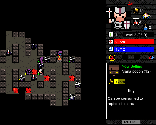
Nothing wrong with that, except that when you click "Buy", you see this:
And then you -- augh! Two buttons! Brain freeze!
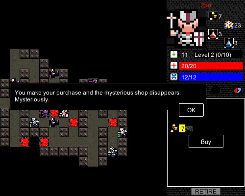
That's a modal dialog in front, you see; when you hit "OK" they both vanish. But I'm a Mac user. The "OK" button is always in the bottom right corner of a window. So when I see this screen, I automatically reach for the bottom right button -- which is the inactive "Buy" button. Yes, even though I just hit it.
It's a tiny detail. Like a hangnail. I have a hangnail right now and it's irritating.
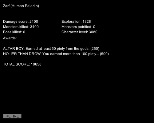
But wait, it's worse. See the gray "Retire" button? That quits the game. You wouldn't think I'd press it accidentally... but it's in the bottom right corner. See the problem?
When a status message appears, it looks like this:
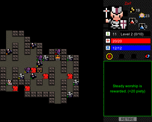
(Patron deities are another one of the mechanics I haven't described.)
As I said, you don't need to click through these messages; you just read them and keep playing. Only there's this button in the bottom right corner. At least twice yesterday I tried to click through a status message, just because the button was there, and accidentally quit.
Mind you, at least twice today I died by attacking a monster that was too strong for me. Sometimes you're just an idiot. But the UI shouldn't tempt me.
Other nitpicks: the spell glyphs. You click on a glyph (the red cross in a circle) and then click the target monster. Well, you wouldn't, because the red cross is "heal self". But pretend I had a fireball glyph next to it. Click glyph, click monster. Problem: there isn't quite enough feedback about what you're going to do. Yes, there's a noise and the cursor changes. But I'd really appreciate some hover text (or text somewhere) indicating what my click is going to do. I've racked up several stupid-deaths by mis-clicking the fireball glyph, so that I whacked the monster instead of fireballing it. Result:
Then there's the UI for discarding glyphs. (You get a stat bonus for throwing away spells, which is a nice bit of side strategy.) You're supposed to drag the spell (the red cross) onto the recycle glyph (the red-blue yin-yang thing). Okay, but this is the only dragging in the whole game! The very fact that spells are draggable is a distraction. The tutorial has to scream "DON'T DRAG SPELLS ONTO MONSTERS", which is a big hint that the UI has gone down the wrong path. Why not follow the usual glyph UI: click on the recycle glyph, then click on the target (the cross glyph)? You'd need a way to deselect recycle, but hey, we need that anyway. Nothing more annoying than clicking fireball and then realizing there's no good target.
Now the disclaimers: Desktop Dungeons is offered as an alpha. When I look at the designer's blog, I see lots of discussion about rebalancing, redesigning, and generally fixing things all over the place. For all I know, the problems I've run into are already history in somebody's source tree.
Also, I've played a bunch of DD in the past five days, so take my complaints as the whining of an addict. Also, the Crypt and Library are kicking my ass. Just saying. Grr.

I'm actually working on the interface for the full right now ;) You raise some really good points, some of them have already been handled, but some are needed noticing, thanks!
The retire button isn't always visible now: You have to go back to the square that you started the dungeon on to use the stairs back "up". Obviously you can retire via the menu at any time (the menu button's orbiting the top right at the moment).
Dragging to convert is a big departure from what the game does everywhere else, you're right. I'm busy making the convert button work with both dragging (which is more natural now given the inventory) and click->select convert target. Also contemplating making spell dragging onto targets autocast, it makes sense to have the things players are going to try just work the way they expected.
The two buttons shop thing is new to me, I'm not up to speed on Mac UIs ;) Will make the buy button die before the popup...
Question: Do you not get an information box telling you what a spell will do when you mouse over it? Also, does the combat prediction for fireballing something work? If not, those are big deals :(
The deterministic combat reminds me of the old Apple II game Odyssey, in which I don't think was entirely deterministic, but the combat was broken down into so many 'rolls' that the odds were very easy to predict. The whole game (the combat part, anyway) was basically about outnumbering your opponent and picking your battles. Kind of like Risk, even more so.
Thanks for replying!
Yes, the combat prediction and the info box both work. And you're right, that is feedback. But looking at the outcomes isn't quite the same as explicitly displaying "To hit" vs "To fireball". It would probably fit in the "next hit estimate" line.
Dragging spells onto targets -- yeah, that makes sense to me as an alternative.
The visual design of this game's buttons kind of make me want to commit suicide.
Aw, it's DOSsy! It's cute! It's... okay, I *said* it's not pretty. :)
What I find even more maddening than the UI issues mentioned in the post is the fact that the game saves its state files in the same directory as the executable, instead of in a proper user-specific directory. Which of course means that if you put the game in the OS's proper application install directory (C:\Program Files for Windows, /Applications for Mac OS X), either everyone who wants to play the game has to be logged in with an Administrator account, or you have to set permissions on the game folder to allow anyone to modify it. Either way, you have everyone sharing the same game state file. What is this, 1990?
Other than that, though, this is a great game!
It may be more effective to send bug reports of that level to the game designer, rather than me. Is just to be saying.