
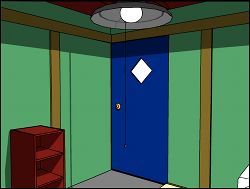
First-person graphical adventures -- Myst -- have become hugely successful in the past several years. Yes, even as Cyan Worlds and Presto Studios and such dinosaurs have withered in the frost. What are popular today are the tiny, casual, unbeautiful and narratively-barren games we call "room escapes". They're written in Flash, and they pour by the dozens out of our web browsers.
(Of course, some are huge, some are hardcore, some are lovely, and some are rich story-worlds -- I don't have to link examples, do I? That's not the point. The escape genre has conventions, and they're not trying to live up to what we thought all graphical adventures would be like from 1994 onward.)
When I got my iPhone, I thought "Room escape games! Perfect! Little puzzle environments to explore while riding the subway to work." (This was when I rode the subway to work.) I looked through the nascent App Store, and found... a couple. There was no easy porting path for existing games, due to the whole Flash situation, and only a couple of developers were writing for iPhone directly.
More room escapes have appeared in the past two years, but it's still not a big corner of the App Store. More important: none of the games, as far as I've researched, have really thought about the iPhone (touchscreen) interface, and what it means for first-person graphical adventures.
The model did not originate with Myst, of course. It's almost inevitable in a modern computer UI: you see on the screen what you would see in the world. Your mouse is your hand, and you click an object to push, pull, move, or take it.
...Except that "the modern computer UI" is the mouse and cursor UI. Myst (and its predecessors and descendants) took full advantage of the cursor to provide a graduated, explorable experience. You look; you see an object; you consider whether it might be manipulable; you move the mouse over it; you see the cursor change to a hand; you consider what clicking might do; you click and find out. It's almost a subliminal process, but it's real.
Hello, the touchscreen -- no mouse, no cursor. You're touching the scene directly. That has to improve immersion... right?
Maybe. It changes the game. Simplifying a UI can improve it, but short-circuiting a puzzle can ruin it. Do you explore the room by tapping every object in sight? That's not exploration, that's a rampage. You've just pushed every button, opened every unlocked door, and picked up every object! -- just to get yourself oriented. You might not have even realized that something is a button (or jewel, or door); it fired "all by itself" when you touched it at random. No moment of realization, no intention of agency. The pacing is all wrong.
Designers have tried to cope with this in several ways. Some games simply don't put much weight on discovery; clicking blindly is the expected path. (Not a popular path, however. Game review sites tend to frown on Flash escapers that omit the changing mouse cursor.)
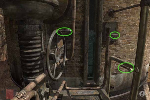
In the iOS port of Riven, Cyan implemented a "shake to reveal" hint mechanism. Shake the phone, and green circles pop up (briefly) around important hotspots. It's effective, but not very immersive. The green circles come across as graffiti on Riven's classical artwork, and -- worse -- they're not much like exploration. You can't wonder about them or discover them. They're a menu, and you folks know how I dislike menus as an adventure UI.
(Down a side path we find the "hidden object" games. These have been ported to iOS in fair proliferation. Partially because they're a popular genre, of course; but also because the discovery model is simpler. The game has no notion of thinking about what to do; you see a correct object and click it. That fits perfectly on a touchscreen. The hidden-object games that include real adventuring elements -- yes, many do -- get away with a suboptimal tapping interface because that's not the main point of the game.)
Let us back up.
Look around; see; consider; investigate; think about results; try it. What can fill these roles? "Look" and "see" haven't changed: we display a scene. You consider an object. You investigate... surely by tapping it. Tapping is the most basic touchscreen interaction.
Now you know the object is manipulable, but you haven't done anything with it. You've gotten a hint about what might happen, and you're thinking about whether to try it or move on. Finally you try... what?
How about dragging the object? Most real-life interactions (outside of elevators and iPhones!) involve moving things, not just touching them. Myst is full of buttons, but it also includes levers and dials -- things to pull, rotate, slide, and lift.
With this, our interface comes together. Tap is investigate; drag is act. Tap a lever, and it jiggles; it is eager to be pulled. Tap a door, and it will shift slightly on its hinges -- unless you hear the sad "clunk clunk" of a locked door. Tap a key lying on a desk, and it will rock a little. Then you pull the lever, or slide the door open, or pull the key to your inventory bar.
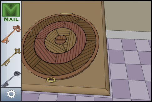
And buttons? Frankly, we'll do without them. This is rough news for the porters of an existing graphical game, but rethinking an interface means rethinking your game design. Change them to toggles or knife switches. The good news is that dials and combination locks work wonderfully; rather than clicking "up" and "down" buttons to set digits, you drag the wheels around or spin them with a flick.
I've built a prototype of this interface. You may recall it as Secret Project KLD. I didn't build a complete game, but I built enough to prove that the UI works. The trick is to make these dragging motions continuous -- or continuous enough, anyway. When you drag a slider back and forth, it should actually follow your finger on the track. When you drag a door open and closed, it should move wiht your touch. Full 3D modelling makes this easy, but might be too heavyweight for a mobile device. I found that six or eight "keyframe" images is enough to make the illusion work. The direct responsivity of touch more than makes up for the jerkiness of the animation.
Navigation is trickier (but then, it always is). To see a close-up view of an object (if it has a close-up) you should simply tap it. Tap is investigate, after all. By extension, tapping on an open doorway should move through it, and tapping on the edge of the screen should turn around. Now tap is somewhat double-purposed (but then, it always is). I think this is acceptable; walking around a room to look at things is okay for an automatic action. It's always reversible (perhaps with some jockeying to turn around and find your way back). You won't accidentally solve a puzzle or mess up your known position, as long as the game has no step-and-die traps (which, of course, it shouldn't).
I have most of the KLD game designed, and I modelled quite a bit of it in Google SketchUp. Why did I put it aside? It turns out that SketchUp is good for modelling, but not great for placing comeras or rendering frames of moving parts. My graphics workflow was slow and painful. Also, the artwork that I did produce was sized for older iPhones; I'd have to rethink the whole plan for iPads and the new double-resolution iPhones. I may get back to the game someday, but my immediate future is pinned to text IF.
So here you go. The correct model for a touchscreen-native adventure game. Somebody run with it.

Simplifying a UI can improve it, but short-circuiting a puzzle can ruin it. Do you explore the room by tapping every object in sight? That's not exploration, that's a rampage.
I do know someone who beat Riven essentially this way, so a mouse doesn't exactly prevent this approach entirely.
Any thoughts about multi-touch? Forget tapping at the edge of the screen to turn... that was always an unfortunate disadvantage anyway. If you've got the resources, I would prefer a 360-view (a-la Myst III and IV) with a two-finger drag to look around. You could also pinch to zoom out of a detailed look at an object - I always disliked figuring out which edge of the screen would take me back.
I don't have to link examples, do I?
I actually would like to hear what some of your favorites are. And what is... oh, Viridian Room. Well, that's an example of at least one of those.
Nothing but good scene design can *prevent* the pixel-hunting approach. The question is whether the game convinces the player to go for a more immersed experience first.
Re multitouch: the problem is that two-finger moves are still undiscoverable, or not easily discovered anyway. The pinchy move for "zoom out" is natural enough when you're moving a picture, which responds dynamically as your fingers move; it's weird for a binary transition.
(The correct answer is clearly "any edge of the screen should take you back.")
I also tried setting up swipe gestures for turning left or right (or facing up). Some people did try that rather than tapping the edge of the screen -- but again, without feedback (the dynamic shift of scrolling) it's hard to calibrate yourself.
Let's see... Tesshie-e and Gotmail make some of the prettiest escape games ( http://jayisgames.com/archives/2010/09/escape_from_restaurant_minshio.php or http://jayisgames.com/archives/2007/06/the_shochu_bar.php , for example). Mateusz Skutnik's Submachine series has a wonderful running story; start with http://jayisgames.com/games/submachine-remix . And for an early classic, http://jayisgames.com/games/the-dark-room/
I'm also fond of the Dismantlement series ( http://jayisgames.com/tag/dismantlement ), which dispense with the physical locale in favor of a single object.
Interesting... that doesn't really overlap with my list at all. I really like the Trapped trilogy, especially part II -- more of an escape-the-house game than an escape-the-room game, but then Submachine also isn't really a room escaper. Anyway, my favorite plot of any room escape even if I can't quite make sense of it, or maybe because I can't. Also the Something Amiss trilogy, which really is just a point-and-click adventure in Flash (I may be more impressed because I haven't really played any of the non-Flash ones). The plot is a little absurd but the atmosphere is gorgeous. For the classic Japanese pure-puzzle ones I like Neutral's games, especially Vision, and Place of Light (wish someone would translate the text on the Room Fake etc. games). I should say that I spend a lot of time with the walkthrough for most of these, especially the Place of Light games which get completely insane.
I like Tesshi-E's stuff. Submachine kind of drove me insane with the 98-room one -- way too much to keep track of; maybe I should start over with the remix. Gotmail is pretty but sometimes the gameplay seems totally unmotivated -- in Strawberry Tomato jul qbrf gur tbbfroreel wryyl haybpx gung qbbe?
Different strokes as usual. I haven't done nearly as many of these games since I rediscovered IF.
Ah, I'd forgotten the Neutral games. I've played the ones you mentioned. (Something Amiss was nice. Trapped spent a little too much annoying me with navigation and objects randomly appearing as the plot advanced.)
Well, I try to play every one that goes by, and it's added up to a lot of games over the years.
I try to play every one that goes by
Wow. I used to play most of the ones that appeared on JayIsGames, but even that is a lot to keep up with -- looking at sites like freegamesnews, playing them all seems like it must be like drinking from a fire hydrant.
Dragging is alright, but it gets tedious constantly trying to drag things in just the right sort of arc. If Riven required me to drag along the operational path of the machine, I'd find myself constantly wishing they'd make the machines simpler.
I don't mind the two tap thing that graphical games are into these days. I played one iPhone game (sorry I forget the name) where a tap would bring up 3 to 6 action icons in a circle.
Even if you don't want the intrusion of action icons, I still think a tap/double-tap system would be preferable to dragging. Or how about this... distinguish between a touch (resting your finger on something) and a tap (a hit followed by a quick release). With a touch you're feeling it, with a tap you're kind of striking/pushing it. Keep your finger down and drag it around the screen, and instead of a precision movement, the drag becomes a method of exploration, run your hand over things and see if they 'budge' slightly. Dragging is a very scanning-like motion whereas tapping is more decisive, so I vote to actually stand your proposed setup on its head.
A very interesting article! I like your touch ui ideas and would probably take a similar approach. I think the problem with reversing them - drag to explore - is the amount of screen real estate obscured by your finger. Of course, we can always make objects 'pop' or some other effect, but it seems laborious to me to have to swipe around the screen looking for hot spots, rather than tapping directly on an object of interest.
Each to their own though, and both approaches have their merits. It's good to see people considering different methods. I hope we see more adventure games on iDevices; Flash limitations aside, it's surprising there aren't more developers exploring the opportunities this technology presents.
Okay, I admit that I try to play every one that goes by *on jayisgames*. I figure that includes all the good ones.
I like that the last two comments take opposite views on the "drag to explore" alternative. It's clearly worth some more prototyping.
(I hate "tap to bring up an action menu", though. Always have.)
My KLD prototype responded to the dot product of your drag direction with the "right" direction. So as long as you were within 180 degrees, it would work (perhaps slowly). The responsive animation was crucial -- that allowed you to see the motion in progress, understand what was going on, and perhaps correct your movement on the fly.
I can see how real-time feedback would be crucial in a drag-to-initiate-action system, to avoid people assuming that they need to be more accurate than they really need to be. (Relative computer newbies make that kind of mistake frequently.)
I seem to recall that there were a couple of controls that had to be dragged in Myst, but I found them annoying, and in Riven they pretty much abandoned that for what seemed to me obvious reasons, and went with click-only. Mind you, mousing is a different environment, but I think that decision is somewhat telling. Attempting to accurately drag things just seems more onerous. Possibly my suggestion is open to the same criticism, but I thought since you don't really have to be accurate when you are 'scanning', it would work out better. Could be wrong I guess. (But since your finger would likely always be in motion looking for items that 'budge' when swiped over, I don't find the 'it obscures your vision' objection is very convincing.)