 YouTube review by me of the original M.U.L.E. is here, if you need some background.
Last night I played a couple of games of the brand-new Planet M.U.L.E. - one with some friends over the internet, and one by myself. It is a faithful (sometimes a little too faithful) adaptation of Dani Bunten's original economic simulation from the 1980s, and it does indeed finally meet the long-time dream to bring internet playability to this intrinsically multiplayer game. Unfortunately, at least in its current version, Planet M.U.L.E. is marred by some design choices that will, I fear, significantly limit the size of audience.
More details after the jump:
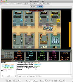
Despite the extra word, Planet M.U.L.E. is M.U.L.E., through and through. It updates the graphics, sound and music only as much as necessary so that they don't seem completely out of place on a modern computer. It leaves every other aspect of the game completely untouched, from the many examples of on-screen text to the pace and style of the various animated events. I cannot tell for certain that the game's internal rules for supply-and-demand simulation are the same, but I have no reason not to believe it. [Update: See's Eeyore's comment.] Any player of the original game will feel at home here, and anything you might have heard, read or seen about the older game will apply directly to this one. So in that sense, yes, it's just as worth your time to play, and that counts double if you especially enjoy internet-based gaming. (Part because it's a lot of fun, and part because computer-controlled players in this game are dreadfully conservative and boring - which, I seem to recall, was also the case with the original.)
This faithfulness to the source material is followed so closely that it sometimes results in cross-time oddities. For example, the on-screen text makes reference to the player's "button" and "stick", as if they're using an archaic one-button joystick, rather than a keyboard with a spacebar and arrow keys. This seems a willful choice to adhere to the letter (literally!) of the original game, even at the cost of confusing modern players by deliberately printing incorrect instructions on the screen. I can guarantee you that every single first-time player, seeing the message "Press button when ready", will think Er... which button? before flailing uncertainly at their mouse and keyboard until something happens.
(A smaller and more curious example: one of the random events makes reference to "your Space Gypsy cousins" trashing the town. This might have been seen as a harmlessly cute joke a quarter-century ago, but it is only winceworthy today. Couldn't we have made them, I don't know, "Space Hobos", or something?)
Planet M.U.L.E.'s deeper flaws lay not in its gameplay or interface, but in its distribution and packaging. First of all, the game is presented as a downloadable Java application. I'd be curious to know the developers' reasons for not making it a web application, Flash-based or otherwise. One of the lessons that Zarf and I learned with Volity was that most people, including most "gamers", hate downloading stuff, and will avoid it as much as possible. Someone who is only mildly interested in checking out a game will, upon discovering that it requires a download, wander off in search of easier entertainment. Put it on a webpage, on the other hand, and you have a much better chance of hooking them.
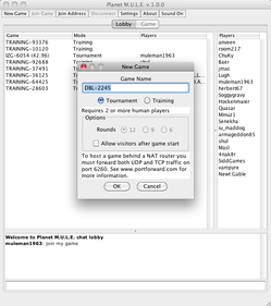
 Once you have downloaded it, you must endure a wiltingly player-hostile setup process before you can enjoy the game. You are faced with a stark and colorless window with controls for starting new games or joining internet games in progress. The program informs us that, to host a new game, the player must open a couple of ports on their firewall, and then set up port forwarding for them; in other words, they must be willing and able to mess around with their home router's configuration. This effectively excludes anyone except for begging-your-pardon nerds (like me, yes, like me) from accessing one of the core modes for any internet-based game: the ability to set up a table, populate it with our friends, and kick out the riffraff. It also bars anyone who might not have access credentials to the local router - I'm thinking of kids, here. That's a shame.
It's true that you can just join existing games in any case. However, if you and a friend wish to play together without having to deal with any strangers, but neither of you happens to have the ability to modify your home network configuration, then you're out of luck. Or, more likely, you'll try anyway, get frustrated at the hanging "Connecting..." screen, and then give up entirely.
(And, that it requires the open ports in the first place questionable by itself - I have enjoyed many internet games from behind the snug safety of my NAT's firewall, and none prior to this have asked me to punch holes in it for their own benefit.)
This very cranky and dirty interface for setting up a game lies in direct opposition to the simple and smooth interface for actually playing the damn thing, once you've gotten it going. I know that the presence of internet play meant that the developers had to make an exception to the literal-adaptation philosophy (I believe the method for starting a game of the original M.U.L.E. was "Press the Start key"), but it's as if they strapped the game to the Java-UI equivalent of one the game's titular ornery and failure-prone beasts of burden, rather than a fittingly friendly and helpful interface that doesn't require any more network knowledge than, say, a typical Xbox Live user would have.
Sadly, there were some out-and-out bugs, too; I experienced several crashes while setting up my multiplayer game, and suffered a fatal freezeup when I was playing single-player. Problems like these are par for the course for any v1.0 product, and I expect them to be fixed presently. But again, because it's a downloadable game versus a web-based one, the burden is on the player to check for and then download new versions by themselves, rather than simply reload a webpage. (And, no, the application doesn't appear to have a new-version-checking feature.)
I had fun playing Planet M.U.L.E. with my friends, and look forward to playing it again. I congratulate Turborilla and Blue Systems on the loving gameplay adaptation, and on getting it all shipped on time. But all that said, this is a mule that could stand to spend a little more time in the outfitting shop.


It's not the same.
Crystite in particular does not work the way it's supposed to. It gets no economy of scale or proximity bonuses, apparently. The only way to really win the game is to go heavily into Smithore. It's like the authors adopted the computer player strategy back in 1986 and never learned any other way to play the game.
Also, everybody knows mining isn't supposed to be allowed in the river valley. What's up with that?
You are clearly one who played the original game far more than I did - I was introduced to it only two years ago - so I humbly submit to your observations. Hmm, and I will add a link to them from the review text, as well...
It doesn't appear to matter how close the game is since their server is apparently down and I can find no references newer than 2010 on Google to the game. While the Java App I downloaded when it came out (but never got around to playing for some reason) shows the ability to use alternate server locations, one would still need such a server to continue to use the game over the Net. I can't find any mention, really about the game after 2010 period, implying a lack of interest (the game may simply be too cerebral for today's button smashing console types and finger moving iPad players since it's more about business trading than action gaming, really).
I always lamented the fact I could never find any friends that actually LIKED the original M.U.L.E. for my C64 so I always ended up playing the computer (and yes, I used the Crystite approach often along with starving the computer players out by acquiring most of the energy and/or food plots (when possible) so while they tried to mine they often had little or no energy to do so, especially late in the game with a well-timed random catastrophe). I guess I should have played this sooner while I had a chance, although ironically you CAN play the original M.U.L.E. online via an emulator that allows TCP connections to another player using such an emulator. This gets you two real players, at least (four if there's two real players on each end), but of course you have to know people that want to play it.
And finally, yes, I still have joysticks on my current Macs and PCs. Not only do they make gamepads (with dual-sticks like XBox, etc. no less) for Macs/PC, but I also got a set of USB to Atari converter cables that let me use old Atari/C64/Amiga/Coleco joysticks on my Mac or PC and they work as standard gamepads so that means most games designed for joysticks/pads. They work perfectly for C64/Amiga/Atari emulators (being able to beat Impossible Misson on the C64 emulator is a good test since it needs precise digital switching to walk across short pits/holes without jumping or you won't be able to win). In any case, anyone who doesn't know what a button is in 2013 obviously never used an XBox or Playstation 360 so I find that hard to imagine. I'm not sure why such gamepads aren't more popular for PC gaming other than people getting used to the W/X/A/D + Mouse 1st person shooter format. Some games are so much better with a joystick, particularly old ones like this that don't need a lot of buttons but work well relaxing back in a comfortable chair.