The iPhone App Store has opened, and it is time for all game-bloggers of good will to talk about iPhone games.
(The ones of ill will are doing it too, as are those of ill mind, of weak will, and of bad wind. I won't fuss about which of these categories I'm in. Zog knows I can't climb that many flights of stairs without going all anaerobic on my mitochondria.)
I see there are... 219 games as I write this. I haven't found a good way to browse them; the in-phone browser doesn't do subcategories, and iTunes doesn't seem to have complete lists in any category. (At least, this doesn't look like it adds up to 219.) But never mind. I've skimmed through the lists, and seen the expected variety: shoot-up games, tilt-marble games, rhythm-tapping games, and the entire continent of casual puzzle games. (Which consists of the Republic of Rule Mazes, the Sodality of Sudoku, the Mahjongg Concord, the Other Sodality of Solitaire, and so on. All of which are pinched corners around the Grand Imperium of Click On Three Identical Cute Animals. Or jewels or what have you. But usually animals.)
Really, the only reason I post stuff on the Internet is to use the word "sodality" as often as possible. Thank you, Brannon Braga.
But I'm interested in adventure games. Adventures are a gaping hole in the iPhone lineup. Can this be? Surely adventures are common casual gaming fodder! Really -- do any web search on "room escape". Each of these games differs from Myst only in that it is small, indoors, and (usually) visually stylized rather than photorealistic.
It is true that every one of these tiny adventurelets is written in Flash. And the iPhone has no Flash player. But heck -- every shooting, tapping, marbling, mazing, three-animal-clicking games on the Web is in Flash too, and developers had no trouble porting those to Mr. Shiny.
The graphical adventure form needs few changes to run on a touch interface. You don't have the ability to click on tiny details -- but "hunt-the-pixel" was always the reductive failure of graphical adventures (as "guess-the-verb" is for text adventures). It's what happens when the game isn't working. So design your scenes for big hotspots. You don't have a cursor to change to indicate hotspots, either. Maybe dragging your finger around a scene should cause hotspots to flash, to indicate their existence that way. Or maybe you just need really good visual focus.
This is important because graphical adventures normally have two levels of response: one indicates that you can use an item (cursor change), the other is for when you decide to use it (click). And so puzzles can involve a certain amount of "What do I want to do first?" If tapping something activates it, most of your game interactions are going to be accidental. ("Hey, I guess that was a lever!") That's a big rethink of the form.
(Sure, you want to adhere to the "no death, no mistakes" rule -- casual adventuring demands that. But even a benign irreversible action is irritating, if you hit it accidentally. And room escape games have lots of irreversible actions. It's a design convention: when you push the button it stays pushed, when you solve the puzzle it stays solved. Keeps the player's momentum forward.)
Maybe we should roll with the dragging idea: design most of the game elements to require motion rather than tapping. Tapping just causes a quick bounce or jiggle reaction. So if you tap on a cabinet door, it jiggles; that tells you that you can drag it open. I like this idea, actually. Levers everywhere instead of buttons. Drag the carpet back to look under it. Drag found items to your inventory, then drag them back to target hotspots.
I'm not sure whether edge buttons or flick-scrolling is better for turning left and right -- that will require some testing. (If finger dragging gets coopted for one of the above ideas, I guess you're forced to use edge buttons.) Pinch-zoom seems like a clever idea for close inspection of scenes, but I suspect it will work best in moderation -- closeups only.
Text adventures! My character sheet says I'm supposed to talk about text adventures. (In fact I already have; this bit of bloggery is adapted from a couple of posts I made on rec.arts.int-fiction.)
The App Store already has a text adventure -- the text adventure.

This is a freeware application being distributed by "Pi-Soft Consulting" (which looks like it's the same as Shawn P. Stanley).
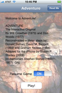
A bit of historic neepery which will be of interest to practically nobody: the splash text shown above is misleading. It is taken from Graham Nelson's Inform port of Adventure -- which, as the note says, is adapted from Dave Baggett's TADS version of Don Ekman's Fortran source code.
Which is fine, except that Shawn P. Stanley didn't use Graham Nelson's port. He adapted Jim Gillogly's C source code. This also descends from the Fortran version.
The two versions feel rather different. Were one to play Graham Nelson's version of the game, one would find a refined parser supporting features such as "get all", more synonyms, abbreviations like "x" for "examine", and a long historical introduction. Gillogly's port uses the original, simplistic parser. There are a few gameplay differences as well.
On the other hand, it's the same game. Both versions cover the classic "350-point" Crowther&Woods edition of Adventure, as opposed to any of several extended remixes. I just don't get why Stanley chose to write his credits this way.
(I'm not accusing him of misconduct. Adventure has always been, in hacker tradition, been considered free software. Jim Gillogly's port is explicitly licensed as open-source under the BSD license. And Stanley is distributing iPhone Advent for free.)
On both hands, the dedication to Stephen Bishop is appropriate to any version of Adventure.
Let's take a look at the game itself.

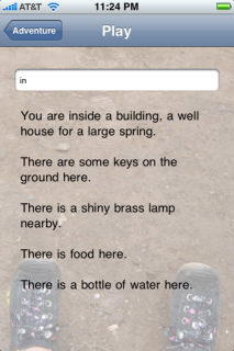
The interface is straightforward. You have an input line. When you tap on it, the usual iPhone tap keyboard appears, and you type your command. Hit Return and see what happens.
Well, perhaps not so straightforward. This implementation only shows the response to your most recent command. There is no scrolling game history, such as IF players are used to. If you type "get lamp" at the prompt above, the visible text changes to the single word "OK" -- poor context at best.
The obvious fix is to move the input line to the bottom of the screen, and show the game history above it. Right?
Wrong. The iPhone really wants the input line near the top of the screen, because the keyboard is always at the bottom. If the input line is at the bottom edge, it'll just slide uphill when the keyboard pops up, and that wouldn't be great.
So I want the input line at the top but a standard IF scrolling pane below it, with commands interspersed in the usual way. (You'd have to ensure that finger-scrolling only affected the text pane, not the entire screen. This is possible -- in fact Advent does it, with long responses such as the "help" output.)
(That model obviates the need for the input line to keep showing the last command, which is confusingly out-of-order.)
What else does the perfect iPhone IF application have? I'll move away from criticizing iPhone Advent, and talk about general features.
I'd like a special button to the right of the input line, which brings up a menu of one-touch common IF commands. A compass rose of movement commands, "look" and "inventory", maybe "undo". (iPhone Advent doesn't support "undo", but modern IF does.)
The splash page should have a "how to play" button. The mainframe-style "Do you want instructions?" when you start is all wrong.
PDA IF traditionally has some kind of "tap a word to paste it" interface. I want that but it's hard to do with a touch-screen, because words are tiny. The ideal solution might be to invisibly mark up the output text with "this word is important" spans. That opens up a certain amount of blind hunt-the-pixel exploration, but if brute force is tedious and generally useless -- ie, if only the obviously important words are marked -- I don't think it would sidetrack players.
Finally, the backgrounds. I rather like Advent's low-contrast cave photos. (Emily Short disagrees.)

However, what would be even keener would be a map. (I like drawing my own maps, but mobile IF players probably don't have a sheaf of blank paper handy.) Not a complete map, but one that's filled in as you play. You can see the nearby rooms that's you've already explored.
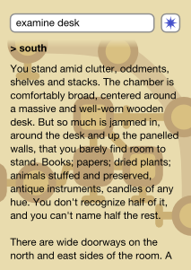
You wouldn't want text on it -- it is, after all, behind the game text, and text on text is hard to read. But a dynamic room map in unlabelled, simple shapes and low-contrast color would be cool. Highlight the current room (or keep it centered). This image is my quick sketch of the concept. Maybe it works? Maybe I'm nuts? Too bright yellow, for sure, but it's late so that's what you get.


Thank you for this nice review. I'm going to get an iPhone some day, and I'd love to play some IF and good old adventure games on it. If you ever come across (better) ones, please let us know.
I still find the background a little distracting, but I can also see the desire to have this on there.
At the moment I think I want the ability to swipe sideways from the text screen to a map screen and back again: that would free the map to be pinch-zoomable, while keeping it all close at hand.
I could be wrong about this.
Oh, I love that map idea. And double-tap a room (a la text columns in Safari) to expand it, and reveal a field for adding room-related notes. Hmm...
Okay, swiping sideways to a map is probably better than my idea.
Jmac, per-room notes are way too fiddly for the zen of iPhone (as I see it). I'd rather have a third screen which is a single notepad (for the whole game).
Zooming maps... not per-room, but per region. The typical IF game map is divided up into several broad regions. Once you have all the zooming conventions available (ie, the map is not behind your text), it makes sense to be able to zoom out to see other regions, and maybe zoom into one of them. (Although the map should still re-center itself when you switch back to the game and make a move.)
(Er, I meant Emily's map idea, with the swipiness. Zarf's is not without its merits as well. :) )
I wish IF got rid of maps and rooms. You know, the purely mechanical simulation stuff. Mechanical puzzling could go too.
Think scenes and acts, instead, like a stage play. And choices, plenty of them. Overarching inevitable plot events and triggered events could go into this picture as well.
Oh, well, perhaps one day...
Through nickm, I learn about Shadows Never Sleep, an interactive fiction piece (though not an adventure game) that's built around the iPhone's zoom function.
FYI, I got the splash text for Advent from Jim Gillogly's C source code. I've never seen Graham Nelson's Inform port.
I'm trying to play the game on my iPad, but I can't turn on the lamp. Please help.